Urban Assets
The Artwork of Joey Manlapaz
 |
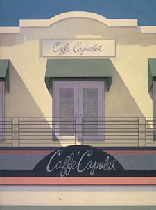
The architecture-driven artwork of Joey Manlapaz leaves the viewer with a strong impression — an impression of structural fortitude, of form’s pas de deux with beauty, of the arbitrary fluidity of those fleeting moments that comprise everyday life. From the astonishing realism of her Washington streetscapes glorifying the city’s old guard buildings to her latest exhibit at the Octagon Museum, Reflections on Architecture, which combines two recent bodies of work — one dealing with Washington storefronts, the other Miami — Manlapaz has yet to hit a wrong brushstroke.
First featured on the cover of this publication in 1995, Manlapaz has, over the years, ventured into increasingly challenging territory. Whether capturing the impact of sunlight on the pastel buildings of South Beach or life reflections flash-frozen in a storefront’s windowpane, creating a complex layered effect, Manlapaz’s work achieves a nearly spiritual quality. She’s not interested in urban nightmares, but in urban dreamscapes, wrapped in a gilded bow of realism.
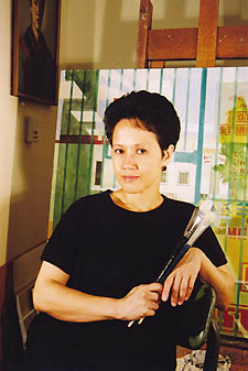
Last Sunday morning, in her elegant Capitol Hill home (which also functions as her studio), Manlapaz spoke about her latest body of work. Excerpts from the conversation, as well as a selection of Manlapaz’s paintings, many from her current exhibit, follow.
 |
“The exhibit was in the planning for about two and a half years. I submitted some twenty slides, and the committee accepted my work, which is primarily architectural in nature, as you know. But in the course of two and a half years [from the initial submissions], my work had changed. My work was mostly architectural facades, and it was mostly Washington, D.C. architecture, primarily 18th and 19th century building. But over the past couple of years, I’d started focusing on reflections in storefronts. And also I’d been going to South Beach, Miami, and was very much enamored by the quality of light there — it was very sunny and the effect of the strong light on the pastel colors of the buildings, as well as the resultant shadows that the light created, was fascinating to me. So I combined the two types of architectural — meaning the Victorian architecture of Washington and the Art deco architecture of South Beach, which was actually the group of work that the American Institute of Architects was more interested in. And I was thinking, ‘How am I supposed to put these two different architectures together in one theme?’ Because they were so different from each other. So I came up with a concept of conservation and preservation.
 |
“The Miami series is more abstract, because it’s a very close-up view of the buildings. It’s not a vista of the buildings in their entirety, but a section of the buildings. What appealed to me was the interaction of the heat with the color and what it does to the color. It’s almost shimmering and you can feel the heat on the pastel colors — your aquas and your pinks and your oranges and your yellows. If you put the same kind of colors here in Washington, it would look very garish.”
 |
“The process of how I choose what to paint is very internal. I equate it to all the millions of people around you — why are you attracted to one person in particular? There’s so many to choose from, but you might obsess about one particular person. That’s the same feeling I get: Out of all these buildings and all the cities in the world that I’ve visited, why focus on certain particular cities and building in that city? So it’s something I really can’t put into words — it is very gut feeling.
“In Washington, I drive around the city and try to see what it is about a particular building that appeals to me. There’s also a lot of intellectual selection about the process. In Miami, on the other hand, it’s a very visceral reaction. As I said, probably because of the memory of the tropics.
“As an artist, you always have to not just think about technique, but also about how it applies in terms of life in general. It’s sort of how you look at people — they’re much more than what you see. and upon meeting someone, it’s the sum total of what’s inside of them because of their environment, how they grew up. So it’s very psychological, this reflection thing. I like how it engages me intellectually, not to mention in terms of my craftsmanship. It’s very challenging. It’s also very tedious with all the minute details that I have to deal with. In terms of technique, [the reflections paintings] are very time-consuming. It’s actually not just two dimensions, it’s three dimensions, because you look at the glass itself, as well as what’s behind the glass and what’s reflected on the glass. So it’s all the activity around the viewer.
 |
“What I’m doing with the reflections: everybody is so busy. You pass by all these storefronts and you see yourself momentarily and then you’re gone, you see people passing by you and then they’re gone. They’re all figments of your memories. And I just capture that one second when you see yourself there, or when you see somebody passing or a car. And that’s just an analogy of life — people just passing through. Then you see it, now you don’t.
“With the Miami series, it’s not really just facades that I’m doing, it’s actually a lot of texturizing, a lot of movement with a brush. I can get myself involved with the surface, because the surfaces are much larger. I give myself some room to breath. It’s freer in terms of brush strokes. I try to do a lot of techniques with a brush and the paint and the quality of the paint, which is thick and gloppy and just lovely to work with.”
 |
“Those storefront windows have changed and evolved since I’ve started painting architecture. They used to be storefront windows for small mom and pop stores. When I was here in the seventies in high school, I would walk around the city, there were a lot of small mom and pop stores around. I’m sure you still see them now, but not as much, not in the city anyway. Now there are storefront windows of big banks, or la-de-dah restaurants, really posh places. What I try to show in the reflections is that even though the window that I’m looking at is now a window for a modern structure, what is reflected on the glass is often the old architecture. Because there are still some of theses old fuddy duddys hanging out. They’re still there. But slowly fading, slowly fading. Who knows how long they’re going to stay?
“When I started painting the architecture of Washington, which was in the early ’80s, a lot of these old Victorian federal-style buildings were being torn down. They would leave one brick façade — that’s all they’d preserve out of the entire building — and knock down everything else beyond it. I guess it’s more economically feasible. But the context is completely gone. The original charm of the building is gone.
 |
“You can always make these buildings very functional instead of knocking down the entire building. But I’m just an artist, I’m an observer. I’m not into policy-making. I can just comment and criticize from the safety of my studio. But I completely understand the economics of the city. We need to move on, it’s the 21st century. My job is just to observe and comment and hopefully put something on canvas. For my sake. It’s not really for anybody else’s benefit. People look at my work and they can either agree or disagree. But it’s a commentary. And that’s what artists do — provide a commentary.”
Reflections on Architecture remains on display through August 1 at the Octagon Museum, 1735 New York Avenue NW. Gallery hours are Monday through Friday, 8:30 a.m. to 5 p.m. Admission is free. Visit a virtual gallery at www.joeymanlapaz.com.
Support Metro Weekly’s Journalism
These are challenging times for news organizations. And yet it’s crucial we stay active and provide vital resources and information to both our local readers and the world. So won’t you please take a moment and consider supporting Metro Weekly with a membership? For as little as $5 a month, you can help ensure Metro Weekly magazine and MetroWeekly.com remain free, viable resources as we provide the best, most diverse, culturally-resonant LGBTQ coverage in both the D.C. region and around the world. Memberships come with exclusive perks and discounts, your own personal digital delivery of each week’s magazine (and an archive), access to our Member's Lounge when it launches this fall, and exclusive members-only items like Metro Weekly Membership Mugs and Tote Bags! Check out all our membership levels here and please join us today!


